Stand in front of a supermarket shelf – any shelf, for any product – and you’ll be confronted by a plethora of options. Too many, perhaps. “Learning to choose is hard. Learning to choose well is harder,” wrote American psychologist Barry Schwartz in his ground-breaking book The Paradox of Choice. This is precisely the hurdle that producers and brands must clear in order to stand out and grab consumers’ attention, but the reasons how and why consumers choose one particular brand or product over others go way beyond simply being “eye-catching”.
Product differentiation, as the science is called, has many aspects in both theory and practice; many of them start with a fundamental understanding of how our brains are programmed, and how that affects package design. “Our brains are a little lazy, and research shows that they very quickly disconnect from things that appear overcomplicated,” says Erik Sebelius, Solution Manager, Chilled Solutions at Tetra Pak. As such, striving for clean, uncluttered packaging design can be advantageous; so too is highlighting and taking advantage of new package shapes – such as Tetra Top® – with clever graphical elements.
Design for the brain
Indeed, there are five neurological aspects1 that can inform best practice regarding packaging design, aspects that brands would do well to heed. “A lot of design is perceived on a subconscious level,” explains Sebelius. “You can ask people what they like about something, but in most cases, they don't really know – they just know they like it. Often, it’s because a package has triggered their emotions – and emotional design features are easier to remember because they activate your amygdala and hippocampus at almost exactly the same time. So, it’s important to consider these aspects when designing your package.”
The brain prefers them. If the package design is not understood, then the brain quickly loses interest; one it disconnects, you have lost the consumer’s attention.
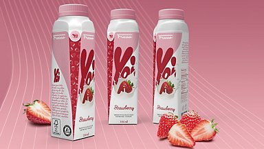
The brain prefers “natural” imagery in association with food products.
The brain seeks out what is novel. And if what is new fulfills a need, consumers' willingness to buy increases significantly.
Centred imagery is pleasing to the subconscious, but shifting the central imagery a little to the left – because the brain prefers images on the left side of the visual field – might further spike effectiveness.
The smallest details in a package design can have outsized effects on the subconscious. The brain takes it all in, so neurological “errors” subtract from overall package design effectiveness.
These aspects are just a starting point – within each, there are further nuances and contextual cues, particularly when it comes to shape. “We've seen many examples where a brand starts using a new package shape, but they pretty much apply the same graphics to it,” says Kristian Jacobsson, Development Engineer at Tetra Pak. “That doesn’t really work, because it appears much the same as what you had before – you're not enhancing the new shape at all. To inspire customers, we make what we call ‘suits’ you put on a package. They demonstrate which graphical elements you can utilise to differentiate your package and enhance the new shape.”

Stand tall to stand out
How consumers perceive size, and in particular height, is another important aspect, one that Sebelius thinks is not so widely understood. After extensive research, the American Marketing Association2 came up with three models to predict consumer perception of size; the conclusion, says Sebelius, was that “there is a tendency for consumers to value the height of a package more than the depth or width. Taller performs better. And while this is generally known among customers, consumers also take width and depth into consideration when judging how much product a package is expected to contain.”
This size impression is also important when it comes to downsizing, or what’s now known as shrinkflation. “Brand owners benefit greatly if their package is perceived as containing a certain amount – say, one litre – but it actually contains less,” says Sebelius. “Because that means more profit. Taller, slimmer packaging can help you do this, as the difference is almost impossible for consumers to detect unless they’re reading all the printed details.” And, he adds, this aspect is most acute when it comes to juice, milk, and other dairy products.

Beware the bright light
These three categories are, of course, often found not on regular shelves but inside fridges and chiller cabinets. As such, there is glass between the consumer and the package, which creates another crucial difference – lighting. “Here, you need to pay attention to how light flows, and how different surfaces shine when under lights,” says Jacobsson. “Different kinds of packaging material textures react differently to lighting, so how they look behind glass can vary. You need to ask: ‘Can our package be seen more or less easily?’”
There’s also the question of position, and how that affects consumers’ initial reaction. “On lower shelves, the consumer will be looking down on the package, and so see more of the top and the cap,” adds Jacobsson. “Only if it’s more at eye level will the packaging, and the design, be perceived more the way it was intended. So positioning is key.”
The power of premiumisation
Some parts of retail stores are considered more “premium” than others, and the chilled cabinet is one such location. This is partly due to consumer perception of refrigerated products being “fresher” and more natural. Indeed, so entrenched is this belief that many brands stipulate that their products be stored there, even though they do not actually require refrigeration – such is the power of what’s called “premiumisation”.


That’s why they recommend a holistic approach to package design, and one that’s adapted to your specific product, package and consumer segment. “The key is composing all the design elements into a cohesive ‘whole’ in a purposeful, meaningful and memorable way,” says Jacobsson.
And this is perhaps the most critical factor with product differentiation – understanding your category, consumer needs and desires, and how to mesh those with what you want your brand – and your product – to convey. Just within colour – the first level in the hierarchy – brands not only have to be aware of how certain colours match certain product categories, but also how they’re perceived culturally by different consumer segments and across different geographical markets.
“We always recommend following Ramond Loewy’s MAYA principle – Most Advanced Yet Accessible,” says Sebelius. “With all aspects of package design – shape, colour, graphics, material effect – it has to stand out and be unique, but not be so different or extreme that you lose people. Consumers can be very traditional and slow-moving when it comes to food. And, of course, what works in one category – dairy, say – won’t work for something like energy drinks or wine. You have to understand your category and your target group.”
After all, he says, with many categories where there’s a wide variety in terms of quality and taste – natural juices and drinking yoghurt, for example – the package is crucial because “the product is the package. We’ve done interesting research that shows when you have exactly the same product and exactly the same graphics on different kinds of packaging, people rate the product in the more attractive packaging as tasting significantly better compared to others. And that means they’re ‘consuming’ with their eyes. So getting your package, and all the elements that go into it, right is absolutely crucial.”