Package design: the science of differentiating your food product on the shelf
Consumers in a typical supermarket are confronted by thousands of different brands and products, all vying for their attention. Clearly, standing out is important, but the science behind how and why consumers choose one particular brand or product over others runs far deeper than simply being “eye-catching”. Product differentiation, as it’s called, has many aspects both in theory and in practice – and is a topic that has engaged Jonas Eklund for most of his working life.

After gaining his degree in Graphic Design from the Danish Graphic Arts Institute, Eklund has spent the last 22 years as Tetra Pak’s Graphic Designer for Northern Europe, working closely with our marketing department and brands to ensure their packaging designs succeed. And as the trend to package more shelf-stable food products in carton packages such as Tetra Recart® – as opposed to more glass jars, aluminium cans, and plastic pouches – accelerates, his expertise in helping clients adapt designs to fit this new format is more in demand than ever.
So why is optimising your food package designs so crucial? “The package is what we call ‘The Silent Salesperson’,” says Eklund. “The retail shelf is where your product meets the consumer, and if the design doesn't really work in that environment, it won't be bought. So it’s an integral part of the marketing mix.”
Eklund points out the key differences between product differentiation and more traditional advertising and graphic design, such as print ads and TV commercials. “When consumers are browsing the aisles, you only have a few seconds to grab their attention, so you really need to focus on the core aspects of your design. The guiding principle here is: Does the package communicate the one or two things you want to get across within that time span? And that’s quite a challenge.”
Keep your food package design simple
Indeed it is. One common mistake that Eklund sees all too frequently is cramming too many elements onto the front of a package, creating a jumble of information. Simplicity here is fundamental – the package and branding don’t just have to sell the product but also create recognition and familiarity. Colours are important too, as is font size and style; they need to be immediate and attention-grabbing, but also relevant to the cues and context of that particular product category. Too jarring or daring can be disastrous – your product will simply “disappear” on the shelf.
“You have to create a connection with the product, as consumers tend to be quite safe and traditional when it comes to choices,” says Eklund. He cites the example of a dairy producer who rebranded and changed from very bright, light-coloured packaging to all black; sales cratered, and the company was eventually forced to change back. “The trick is to make it look like a typical product in your category, but also really challenge the design of that category. It should stand out and be different."
Package design in three dimensions
Other advice he gives food brands includes considering the three-dimensional aspect of the packaging, using all available surfaces for important information or more detailed storytelling. “We call it the 360o of design,” he says. It involved talking to suppliers to understand how and where the package will be displayed (the perils of hidden areas caused by secondary packaging), and including clear and concise instructions on how to recycle it. “The package shouldn’t create any frustrations,” he says, “and if you are a consumer interested in the sustainability perspective, you want to make sure it ends up in the right place.”
Then there are folds and flaps to consider, and how design elements go over or under these. Packaging is, after all, a 3D object, and what can look great on a screen or laid out flat can appear very different in its final form. “Graphic origami” is what this is called; flaps and folds can be designed to continue an element or offer a break or contrast. Eklund uses a special package visualiser tool to create renders and 3D images to check design alignment and test consumer reaction.
A data-driven approach
The latter is, of course, of vital importance. Recent years have seen the rise of computer programs and AI that can track consumers’ eyes and attention when scanning shelves, giving brands hard data to base design decisions on. For example, tools like the 3M Visual Attention Software scores the “probability a part of your visual is seen within the first seconds of seeing an image” and highlights specific “gaze points”; this can be applied to individual packages, or a whole section of shelving. The results, says Eklund, “give you hints on how to create hierarchy or organise your elements to create the best visual grab. It gives you tangible results based on science, as opposed to just saying: ‘I like this design’.”
Such tools are especially useful when deciding on specific design elements; for example, one brand found that changing the brand name to a dark blue increased its visibility to 71%, a significant jump from other colours. It’s all part of Eklund's holistic approach to packaging design; it takes many elements to create a design that will resonate and meet sales targets.
Package design for online channels
One new aspect of this is the rise of online shopping, and how your package will appear as a thumbnail on a screen (particularly on mobile). This shift from the physical to the digital realm creates special demands that brands are not always aware of. For example, online you have no concept of size impression, so designers have started putting the weight or volume of the product in large fonts in prominent positions. Similarly, they've been removing smaller elements for a cleaner overall design, and enlarging key messages; a product claim perhaps, the brand name, or a defining characteristic.
The benefits of doing this can be significant; a combined Unilever and University of Cambridge study showed that using packaging with optimised hero images and messaging for online portals could increase sales by as much as 24%. “It's about bringing forward important elements that you take for granted in a supermarket environment, and adapting product packaging to specific channels,” says Eklund.
It’s an area that's constantly evolving, both in terms of the science of measurement and specific design trends. Regarding the latter, there are many new developments that savvy brands are tapping into. Responsible consumption is an important driver of consumer behaviour, as is leaning on the heritage or legacy of a product; straightforward, easy convenience, encapsulated by very simple, clean designs, is another. There’s also a more modern approach for new, innovative product categories; bright colours, metallized finishes, reflective patterns, and QR codes lend a vibrant, futuristic edge.
On the shelf: the billboard effect
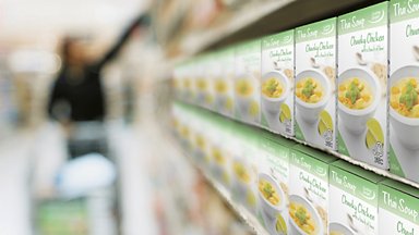
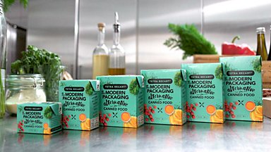
Then there’s the concept of billboard packaging; put simply, this is taking advantage of many flat facing panels on a shelf to create a continuous design effect. It’s complicated, but can be very rewarding, says Eklund. Besides, considering this effect is another absolute must. “It's a good exercise to consider what happens when you have many of your packages sitting together. Does it look terrible? Is there an element you can change to make the design work across multiple panels? And it all comes back to catching the consumer’s eye.”
Ultimately, this is what product differentiation comes down to – connecting the dots between grabbing your attention, recognising the brand or product, and taking it from the shelf or clicking “buy”. “One of my teachers used to always say: ‘Yeah, it's nice, but does it communicate?’” says Eklund. “If a package is just cool or good to look at but doesn’t convey anything beyond that, it’s more like art. It has to work in the sense of connecting with consumers and prompting their behaviour; otherwise, it’s a failure.”
5 tips for optimising product differentiation for food packages:
- Keep it simple. Don’t cram the front panel with too many elements – aim for two or three core messages or visuals.
- Don’t subvert the product category cues too much, otherwise consumers will be confused. You need a connection to the actual product, and to be recognisable within the category.
- A package is a 3D object, so take advantage of that. The top and the sides offer ample space for further storytelling or important information – use it innovatively to stand out.
- Double check the design parameters with the package supplier before you commit to designs – having to make late changes can be complex (and expensive).
- Consider all aspects of the package design to avoid unintentional, embarrassing juxtapositions. This includes folds and flaps, possible billboard effects, and how they might be stacked/stored on shelves.


